Project — 02
2026 — Index
ADOPT
Discipline
Social campaign
A workshop exercise in full-system design: three posters that each stand on their own, yet read as one family — plus the mockups and supporting elements that turn a campaign into a brand. The subject is an adoption association with an unusual rule: the dog chooses its owner. Everyone who wants to adopt fills in a questionnaire and goes through a selection process, and only the best match is approved — closer to a dating app for dogs than to a visit to the shelter.
The brief
Three posters, one design line
The exercise was precise: a series of three posters, each interesting enough to stand alone, yet all held to one clear, unifying design line — plus supporting mockups and design elements. The goal was to bring every skill gathered in the workshop so far into a single piece of work: original, engaging and effective. The subject I chose was an adoption association whose model runs the other way round: the dog chooses its owner. Prospective adopters fill in a questionnaire and go through a selection process that checks who fits best, so not everyone who wants to adopt can — the match has to be right on both sides.
The process
Research first, then a world
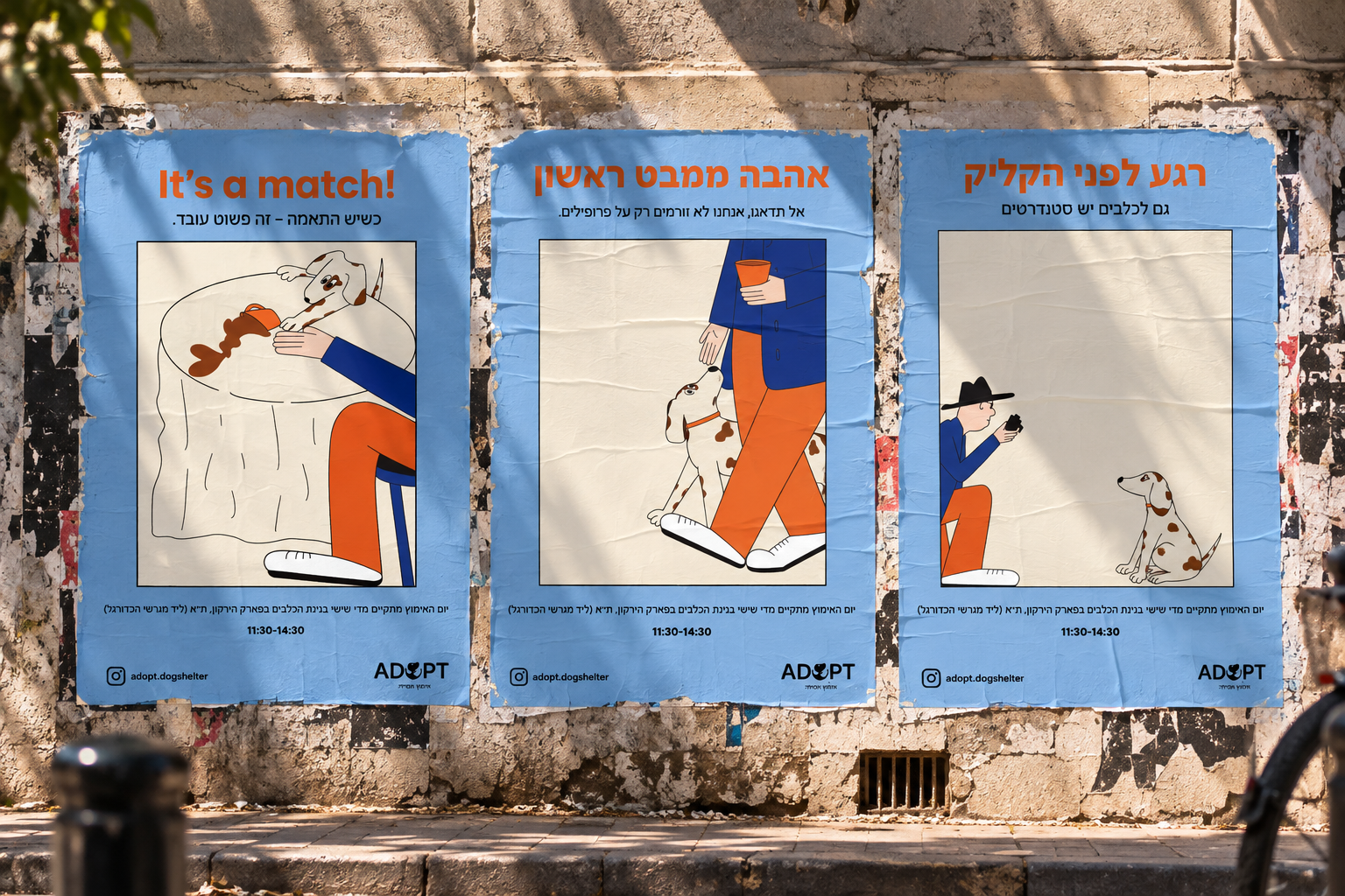
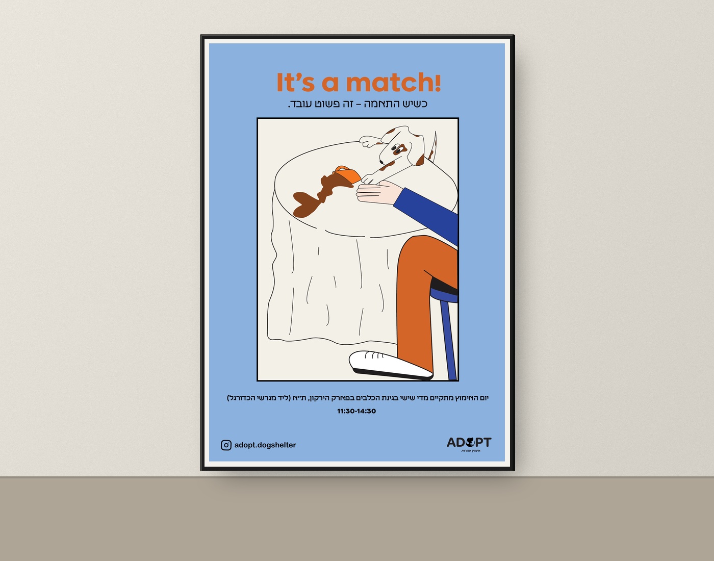
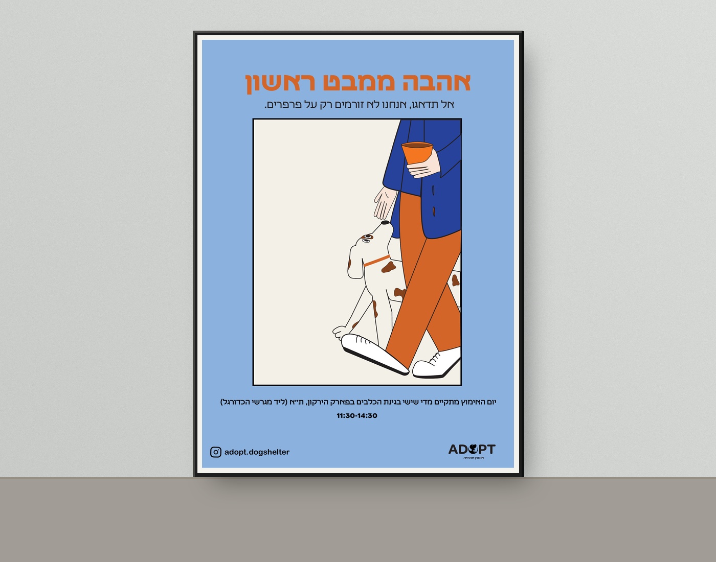
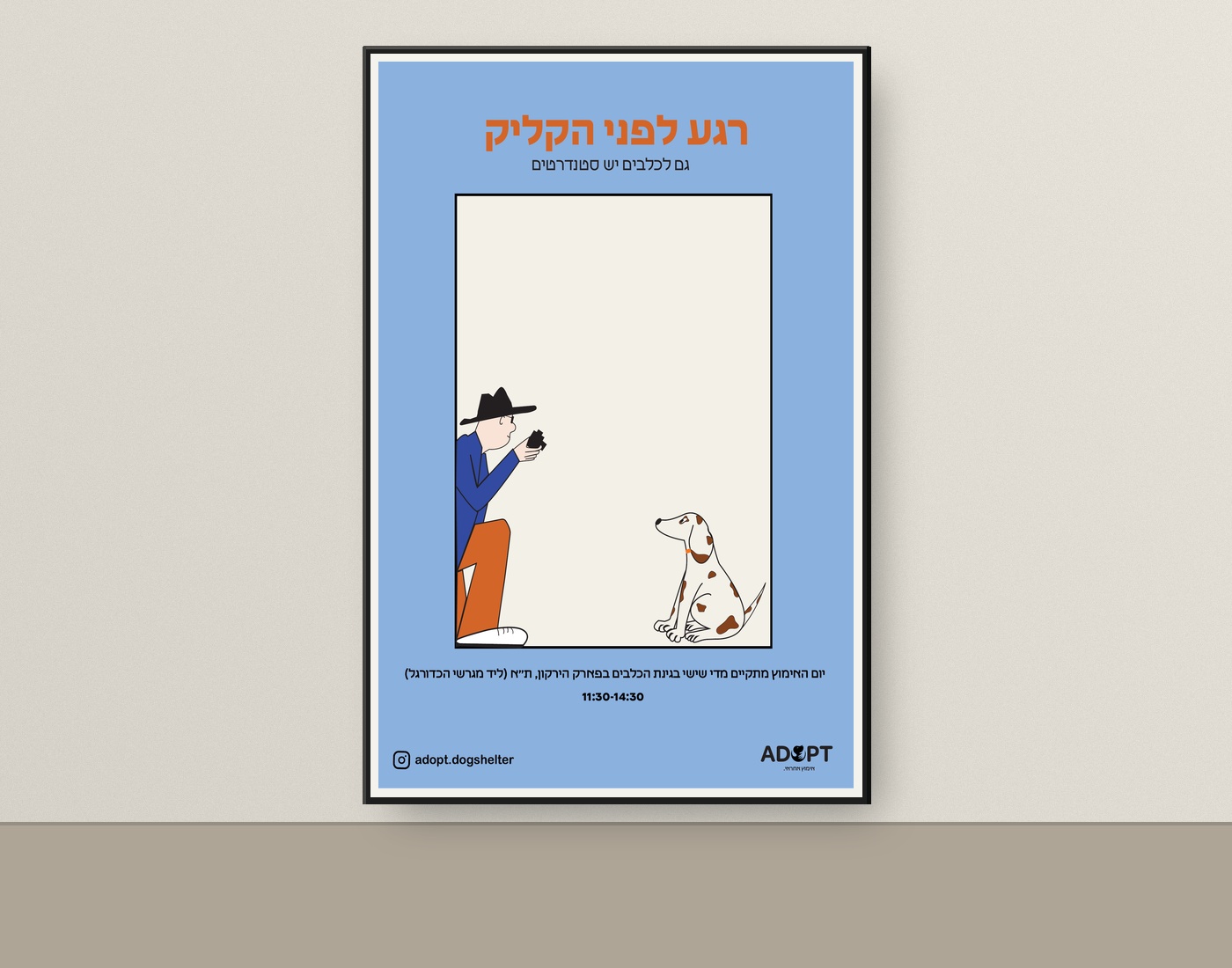
I started with research — how adoption campaigns speak, what makes people stop and what they walk past — and only then built the visual world: a cornflower-blue ground, a cream inner frame, one warm orange for the headlines, and a hand-drawn, brown-spotted dog that appears in every poster. Each poster takes one moment of that matching process and gives it a twist: a blind date that ends in a paw shake (“It’s a match!”), a first walk together (“Love at first sight”), and a photo that never quite happens (“The moment before the click”). One information line, the shelter’s handle and the ADOPT mark — a dog silhouette inside the O — repeat across all three.
The outcome
A campaign that goes beyond the wall
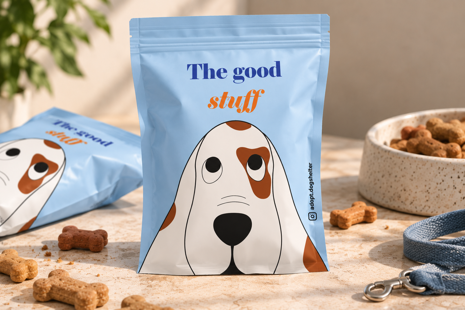
What began as three posters grew into a small system: the poster series itself, a social presence for the shelter, and the mockups that place the work in the real world — framed, printed and pasted on a wall. The piece I enjoyed building most is the treat bag: a stand-up pouch made for the dog who has just been adopted — the first thing the new family brings through the door. The same hand-drawn, brown-spotted dog now looks up from the front of the pack, the cornflower-blue ground carries straight over from the posters, and the name “The good stuff” is set in a bold serif with the last word in warm orange italics. The shelter’s handle runs down the side of the bag, so even the treats speak with the campaign’s voice. Photographed on a stone counter among loose bone-shaped biscuits, a bowl and a leash, the pack shows the idea living in an ordinary day rather than on a wall. Every element speaks the same language, so the campaign reads as one voice wherever it appears.
The identity
One mark that carries the idea
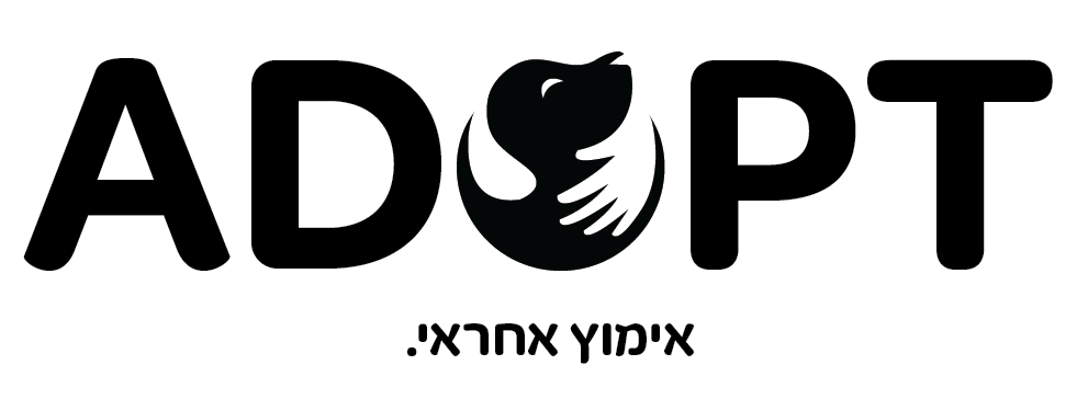
The campaign closes with the association’s own logo: a bold, rounded wordmark whose O holds the whole idea — a dog curled into an embracing hand, drawn in the same friendly spirit as the poster illustrations. Underneath sits the Hebrew tagline “אימוץ אחראי” — responsible adoption. Kept strictly black and white, the mark stays legible at any size and sits comfortably next to every element of the campaign.