Project — 04
2026 — Index
TYPOGRAPHIC LOGOTYPES
Discipline
Typography
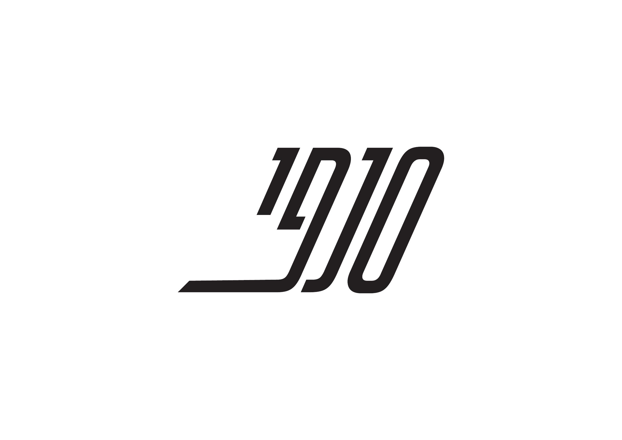
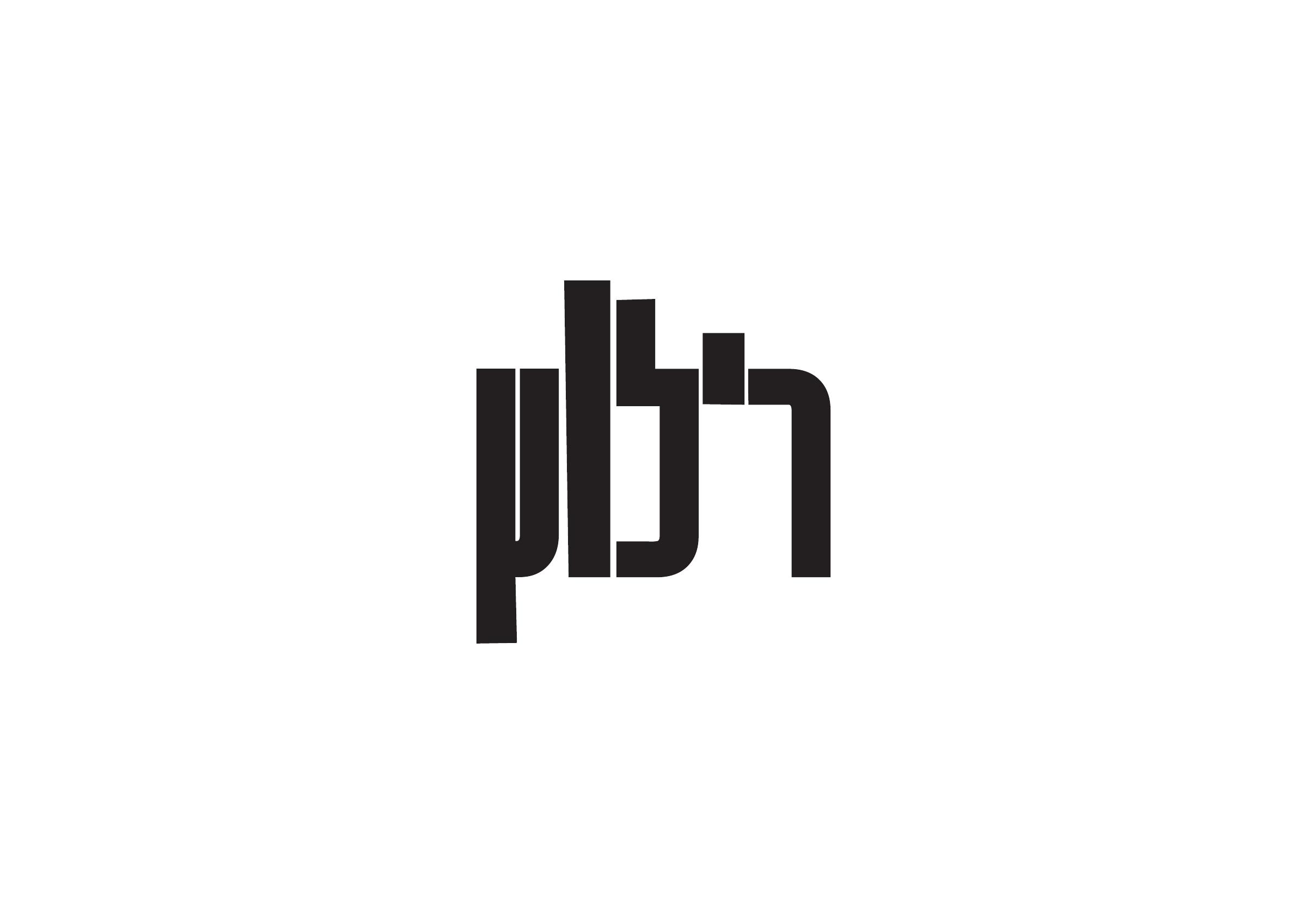
Two invented names for two imaginary companies: SNAPI (סנפי), a shipping company, and RELUTZ (רילוץ), a real-estate brokerage. Neither name describes what its company does, and no illustration was allowed — so the letterforms had to carry the business themselves, through weight, rhythm, spacing and negative space.
The brief
Meaning through letterforms
The exercise asked for typographic logotypes built from invented words, using the tools studied in class: font choice, vowel marks or punctuation, spacing, the white spaces inside a word, adding or removing parts of a letter, and joining letterforms. Two invented names stood in for two imaginary businesses — SNAPI (סנפי), a shipping company, and RELUTZ (רילוץ), a real-estate brokerage — and each had to feel right for its world. One constraint held the whole exercise together: no pictorial or illustrative logos. The meaning had to live in the typography itself.
The visual language
Two rhythms, two characters
SNAPI (סנפי) is built for movement: a strong rightward slant, elongated strokes and a single horizontal line that runs out from the last letter, so the word looks as if it is already travelling. That is exactly the promise a shipping company makes — things keep moving, and they arrive. RELUTZ (רילוץ) takes the opposite route: upright, heavy, modular blocks that touch and share edges into one compact silhouette, with one letter rising above the line and one dropping below it. It reads as structure and permanence — the feeling a brokerage depends on, where the promise is stability and a deal that holds.
The outcome
Typography as identity
Two typographic logotypes that turn invented names into distinct identities for two very different businesses: a shipping company that never stands still, and a brokerage that never shifts. The exercise demonstrates how proportion, direction, density and negative space can establish a tone before a word carries any literal meaning — connecting typographic qualities with the associations they evoke.